Building a configurator
Create a configurator, build its menu tree from groups, products and material groups, and set the player's theme, currency and languages.
A configurator is a menu tree over the products and materials already in your workspace. Vysora Studio puts it this way in the section subtitle: Each configurator is a menu tree over your products and materials — publish it to embed on your site.
Building one uploads nothing and changes no model. You are deciding what your customer sees, in what order, and which swatches they are offered. The model work happens before this: uploading, and telling each zone which material folder it uses. A configurator can only offer what that work has already set up.
Create one
Open Configurators in the sidebar and choose New configurator. In a workspace that has none yet, the empty state offers Create configurator instead. It opens the same dialog.
Fill in Name (the placeholder suggests e.g. Ovvio Chair Configurator). Create stays disabled until the name is at least two characters long, and nothing tells you so. If the button looks dead, the name is too short. Names do not have to be unique.
The name is not purely internal. It becomes the title attribute of the embedded iframe, so screen readers and browser tooling will read it out on your customer's page. Give it a name you would be happy for someone to hear.
Creating the configurator opens the builder immediately, as a draft.
The three-pane builder
The builder has one layout and no tabs or wizard steps:
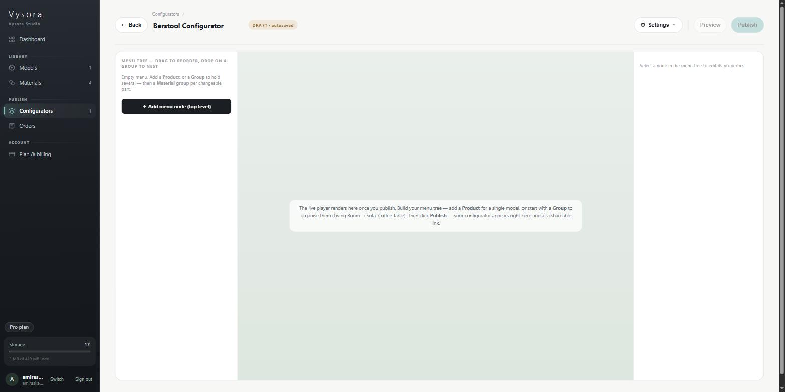
- Left — the menu tree. The structure your customer navigates.
- Centre — the live preview. The published player.
- Right — node properties. The settings for whichever node you have selected. Until you select one it reads
Select a node in the menu tree to edit its properties.
Once you have published at least once, the pane gains a bar reading Published v1 (then v2, v3…) with Copy link, Open ↗ and Reload. If you have edited since that publish, a note appears: You've edited since the last publish — click Publish to refresh this preview.
The menu tree
The tree pane is headed Menu tree — drag to reorder, drop on a group to nest. An empty one tells you where to start: Empty menu. Add a Product, or a Group to hold several — then a Material group per changeable part.
Each row shows a drag grip, the node's English label, and a type chip on the right. Rows indent one level per nesting depth.
The three node types
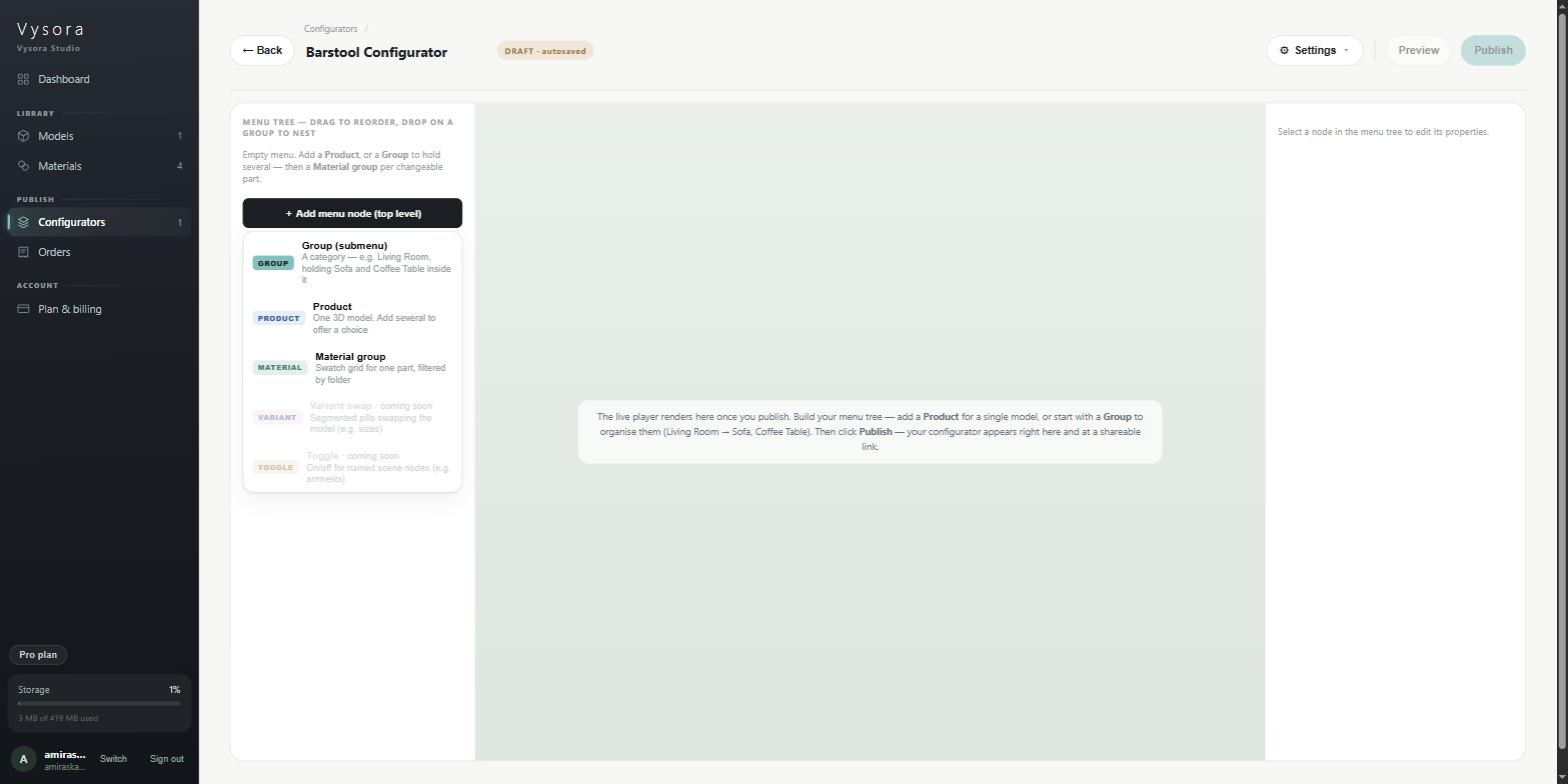
Click + Add menu node… to open the picker.
| Picker title | Chip | What it is for |
|---|---|---|
Group (submenu) |
GROUP |
A category that holds other nodes — A category — e.g. Living Room, holding Sofa and Coffee Table inside it |
Product |
PRODUCT |
One 3D model — One 3D model. Add several to offer a choice |
Material group |
MATERIAL |
A swatch grid for one changeable part — Swatch grid for one part, filtered by folder |
Variant swap and Toggle also appear in the picker, greyed out and marked · coming soon. They are not available yet.
One idea carries several names in the product, so learn them all: the chip says GROUP, the picker says Group (submenu), new ones are labelled Group 1, Group 2, and the button for adding a child says + Submenu. They all mean the same node.
Group (submenu)
A group is a step in the player — the thing your customer moves between with the ◀ ▶ arrows. Everything inside it is shown under it, in the order you set.
Fields:
Label (EN)— the step's name.Cover thumbnail— the step's cover image in the player.Uploadaccepts PNG, JPEG and WEBP. The image is downscaled to a maximum width of 400 px and re-encoded as JPEG, so transparency is lost and a PNG logo on a clear background comes back with a white or black square behind it. Use an image that already looks right as a photo.Add inside "<label>"— the buttons+ Productand+ Submenu, which add a child of that type.
Only groups can hold children. Products and material groups are always leaves.
Product
One product node holds exactly one model. The field label says so: Product with the hint (one product per node). To offer a choice of models, add several Product nodes.
Click the field to open the picker. It has a search box, and it lists only products that have finished processing. A model that is still processing, or that failed, is not there and nothing explains its absence. If the library is empty you get Upload products first — they appear here when READY.
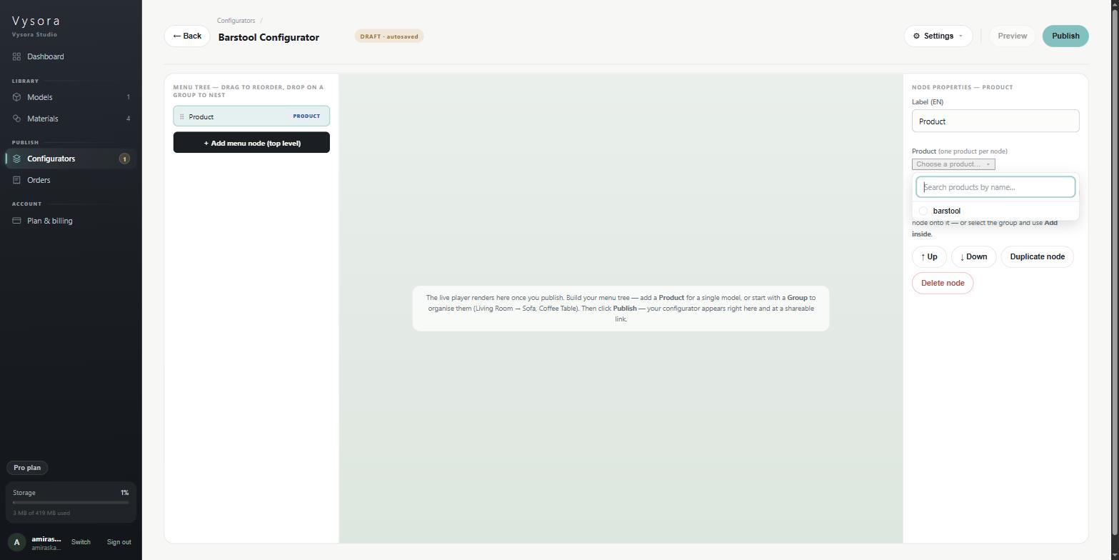
Choosing a product renames the node to the product's name, but only if you have not given it a name of your own. A label you typed is never overwritten.
Showroom and Atelier only
Configurators on those two lines hold exactly one product each. Studio says it on the node itself: Showroom & Atelier configurators hold exactly one product. Create another configurator for the next product. The + Add another product… button is hidden on those lines. If you sell a second item, it gets its own configurator.
Material group
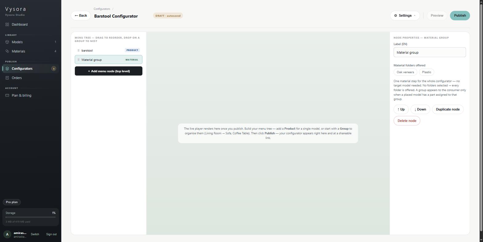
A material group is one swatch step. Its field is Material folders offered: a row of chips, one per folder that exists anywhere in your materials library. Click chips to choose which folders this step offers.
Two rules decide what your customer actually sees:
- Leave every chip off and every folder is offered. Studio says
No folders selected → every folder is offered.Turn one or more on and only those are offered. - The step appears to the customer only when a part of a placed model has been assigned to that folder. A material group with no matching zone is invisible in the player. This is the commonest reason a published configurator looks like it is missing a step, and the fix is in the model's
Material groupstab, not here.
If your chosen folders contain no materials at all, the node shows an error: No materials in the selected folders — consumers would see an empty step. Add materials in the library, or clear the group filter. It is styled as an error but it does not stop you publishing.
Where a new node lands
This is the part that surprises people. The insertion point depends on what is selected when you click + Add menu node…:
| Selected | New node goes |
|---|---|
| Nothing | Top level |
| A Group | Inside that group |
| Any other node type | Into that node's parent — not the top level |
So selecting a Product that sits inside Living Room and adding a node keeps you in Living Room. That is intentional: it is how you build a category out without clicking back and forth. The button tells you where it will land before you press it, reading either + Add menu node (top level) or + Add menu node (into "Living Room").
One more deliberate quirk: adding a Group does not select it. Click + Submenu three times and you get three sibling groups, not a chain three deep. To work inside a group you have just made, click it in the tree.
Nesting and reordering
Drag a row by its grip. Where you release decides what happens:
- Over the middle of a group row — the node moves inside that group.
- Over the top or bottom of any row — the node is placed before or after it, as a sibling.
Non-group rows only ever accept before and after, because they cannot hold children. Dropping a group into its own subtree is refused silently, with no message. If a drag seems to do nothing, that is usually why.
The properties pane also has ↑ Up and ↓ Down, which swap a node with its sibling. At the top or bottom of a list they do nothing, silently.
There is no undo for a drag or a reorder. Drag it back.
Duplicating and deleting
Duplicate node copies the node and everything under it, with new ids, and drops the copy immediately after the original. Only the top node's label gets copy appended. The children keep their original names, which is worth checking before you publish a tree with two Sofa nodes in it.
Delete node needs two clicks: it changes to Confirm delete, and the second click removes the node.
⚙ Settings — how the player behaves
⚙ Settings ▾ in the builder header opens the Player settings popover. These settings describe the published player, not Studio.
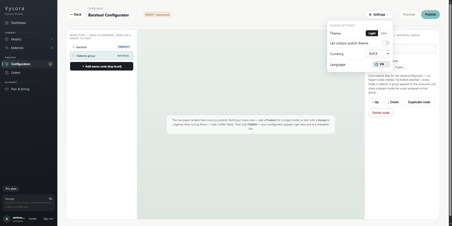
| Setting | What it does |
|---|---|
Theme |
Light or Dark, the theme the player loads with. Default Light. |
Let visitors switch theme |
Gives your customer a light/dark control. Off by default. |
Currency |
EUR €, USD $ or GBP £, used for prices in the player. Default EUR. |
Language |
The 🌐 EN ▾ button, which opens the languages popover. |
The accent colour and the running price total are not here. They live only inside the publish review dialog — see Publishing and embedding.
Showroom and Atelier only
Those two lines also get Exploded view, which adds a consumer explode button, and a Max spread (m) field that sets how far the parts travel. The rows are not shown at all on the Studio line.
Languages
The 🌐 EN ▾ button is inside the settings popover and reachable nowhere else. It opens Languages, described as Choose the languages this configurator offers and which one loads by default.
Seven languages are offered: English (EN), Arabic (AR), French (FR), German (DE), Dutch (NL), Flemish (Belgian Dutch) (NL-BE) and Spanish (ES).
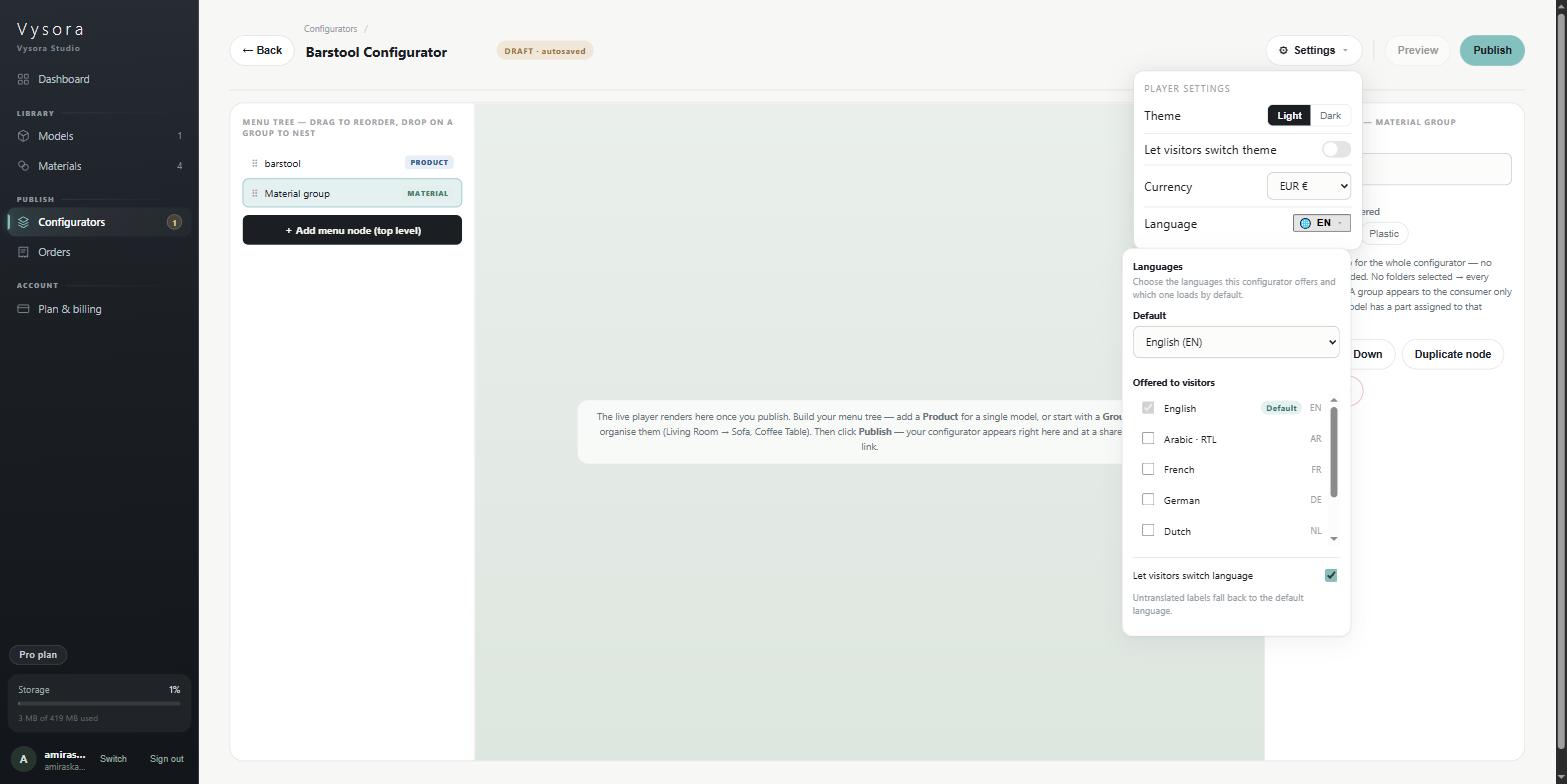
Defaultsets the language the player loads in. Setting a new default adds it to the offered list automatically.Offered to visitorsis the checkbox list. The default language's checkbox is disabled and carries aDefaultbadge. It cannot be removed.Let visitors switch languageis on unless you turn it off.
Arabic is right-to-left: choosing it flips the whole player layout, so plan your labels and cover images with that in mind.
One thing to know before you offer several languages: node labels in the builder are English only. There is no field for the other six. As the popover says, Untranslated labels fall back to the default language — so a French visitor sees the player's own interface in French and your step names in English.
Saving
There is no save button. Studio autosaves about a second after you stop typing or dragging, and the chip in the header is the only report you get:
| Chip | Meaning |
|---|---|
DRAFT · autosaved |
Everything is stored. |
DRAFT · saving… |
A write is on its way, or about to be. |
DRAFT · SAVE FAILED — retrying on next edit |
The last write did not land. |
← Back returns to the list and warns you about nothing, because autosave is assumed to have run. Check the chip before you leave.
Next
When the tree is in the shape you want, you still have to publish it before anyone — including the preview pane — can see it. See Publishing and embedding.